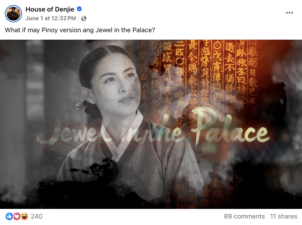
Production Notes #6
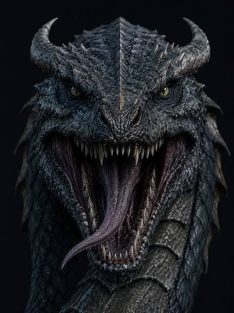
I finally exported the Bakunawa video for Facebook just after midnight. It was one of those days where I kept telling myself, “Just one more revision,” until I realized the day was already over.
Before I could animate anything, I had to lock down Bakunawa's design. Consistency is one of the hardest parts of AI filmmaking, so I always start by creating a definitive version of the character. I spent time refining the shape of its face, the color and texture of its scales, its eyes, its horns, and its overall silhouette. Once I was satisfied with the design, I could generate new scenes knowing the creature would remain recognizable throughout the video.
The voice-over took much longer than expected.
My original plan was to use the Eleven Multilingual V2 text-to-speech model from ElevenLabs, but getting natural-sounding Tagalog narration from it wasn't easy. Unlike English, Tagalog often requires careful placement of diacritical marks to guide pronunciation, rhythm, and emphasis. I spent quite a bit of time experimenting with different versions of the script, but I still wasn't completely happy with the results.
Instead, I recorded the narration myself and processed it using ElevenLabs Voice Changer. That ended up being the better solution. My raw recording had inconsistent volume, with some lines louder than others.
After running it through the voice changer, everything sounded balanced, clean, and much closer to something you'd hear in a professional recording studio. More importantly, it still sounded like a real person telling the story instead of a synthetic voice.
Even with the Bakunawa video taking most of my attention, I managed to make progress on another important part of the project: Alunsina.
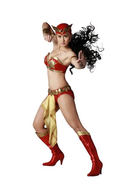
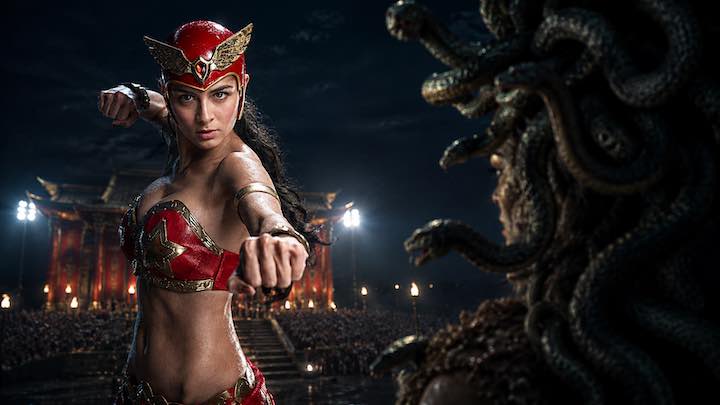
One of the creative decisions I've made for this series is to gradually move away from characters that resemble existing celebrities. While early concept art borrowed inspiration from familiar faces, I want the final cast to have completely original identities. Today, I redesigned Alunsina from the ground up, giving her a face that belongs entirely to this universe.
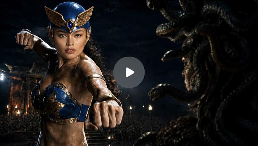
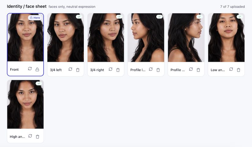
To establish her appearance, I wrote a detailed prompt describing a young Filipino woman with realistic skin texture, natural facial features, expressive eyes, and soft studio lighting. My goal wasn't to create someone who looked flawless. I wanted someone who looked believable. The result surprised me. The portrait feels so realistic that she looks less like an AI-generated character and more like someone you could actually meet in everyday life.
So far, I've completed her base face along with several camera angles. Having multiple perspectives is critical because every future shot, animation, and facial expression depends on maintaining that same identity.
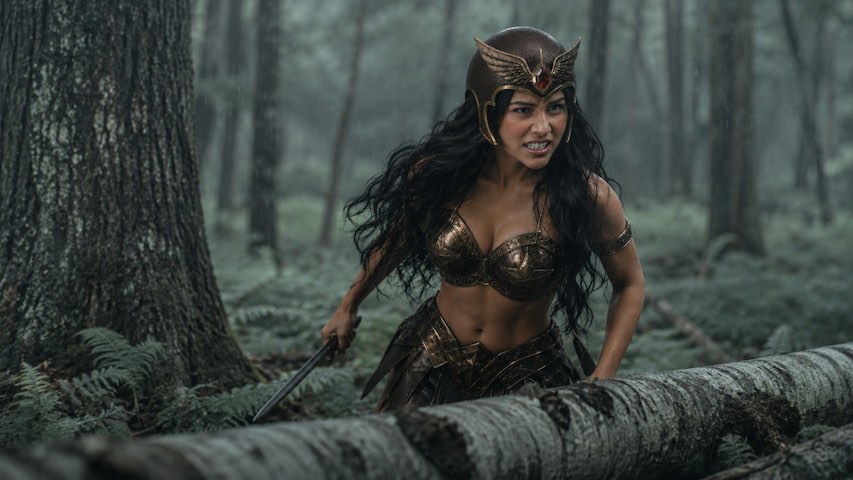
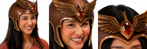
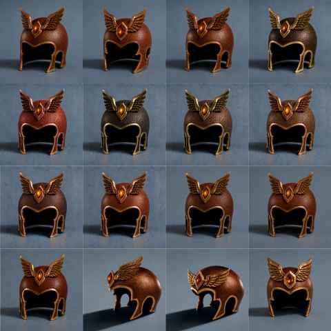
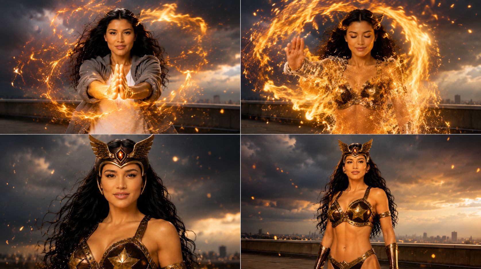
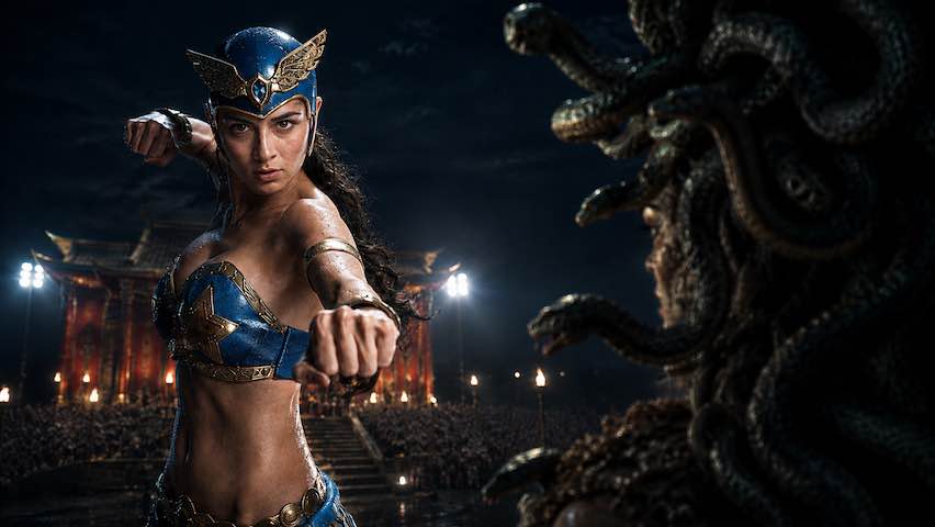
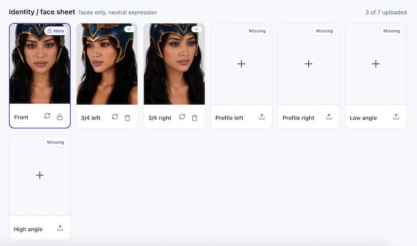
I also started developing Alunsina's superhero form. The biggest challenge, once again, is the helmet.
Unlike a simple costume change, the helmet has to match the character's face from exactly the same perspective. That means I first need to generate the helmet from multiple angles before I can convincingly integrate it into each shot. It's a slow process, but it's one of those details that makes the difference between a believable character and one that immediately looks AI-generated.
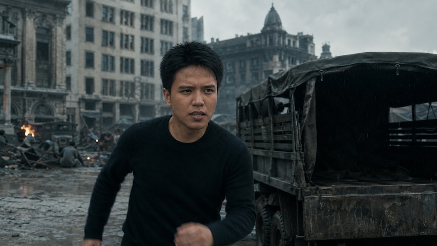
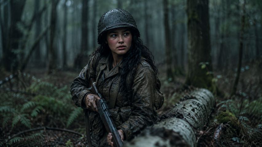
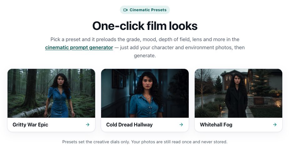
Before calling it a day, I also added another preset to my Cinematic Scene Generator. Every preset I build saves time later by standardizing the project's visual language. Instead of rewriting the same stylistic instructions over and over, I can focus on directing the scene itself. It's a small improvement to the workflow, but dozens of these small improvements are gradually becoming the foundation of how this series is being made.
Some days end with a finished scene. Other days end with a better workflow. Today was a little of both, and that's progress I'll gladly take.